On Perfecting Your Poster

If you intend to sell your film, your artwork is possibly the single most important creative decision you’ll make. Sure, there are plenty of other crucial creative decisions to be made — particularly if you’re trying to make a good movie! — but the simple truth is that people DO judge a book by its cover. And several rounds of people are going to have to judge yours before journey’s end.
Before the movie’s production has even begun, media sources will be far more likely to pick up your story if they dig your artwork. Similarly, distributors you hope to court may pass on your film or put it in their ‘has potential’ pile based solely on the first thing they see: your cover image. And, of course, each and every would-be audience member could dismiss you outright if they perceive your poster to be uninteresting, vague, off-putting, or amateur.
So with that in mind: Behold(!) the journey of a grassroots movie’s poster art from wishful thinking to distributed DVD cover — and beyond!

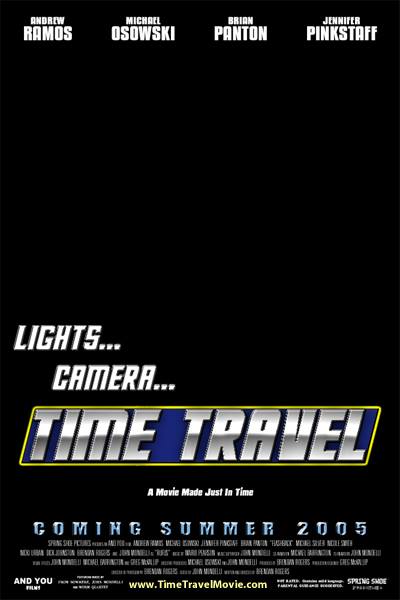
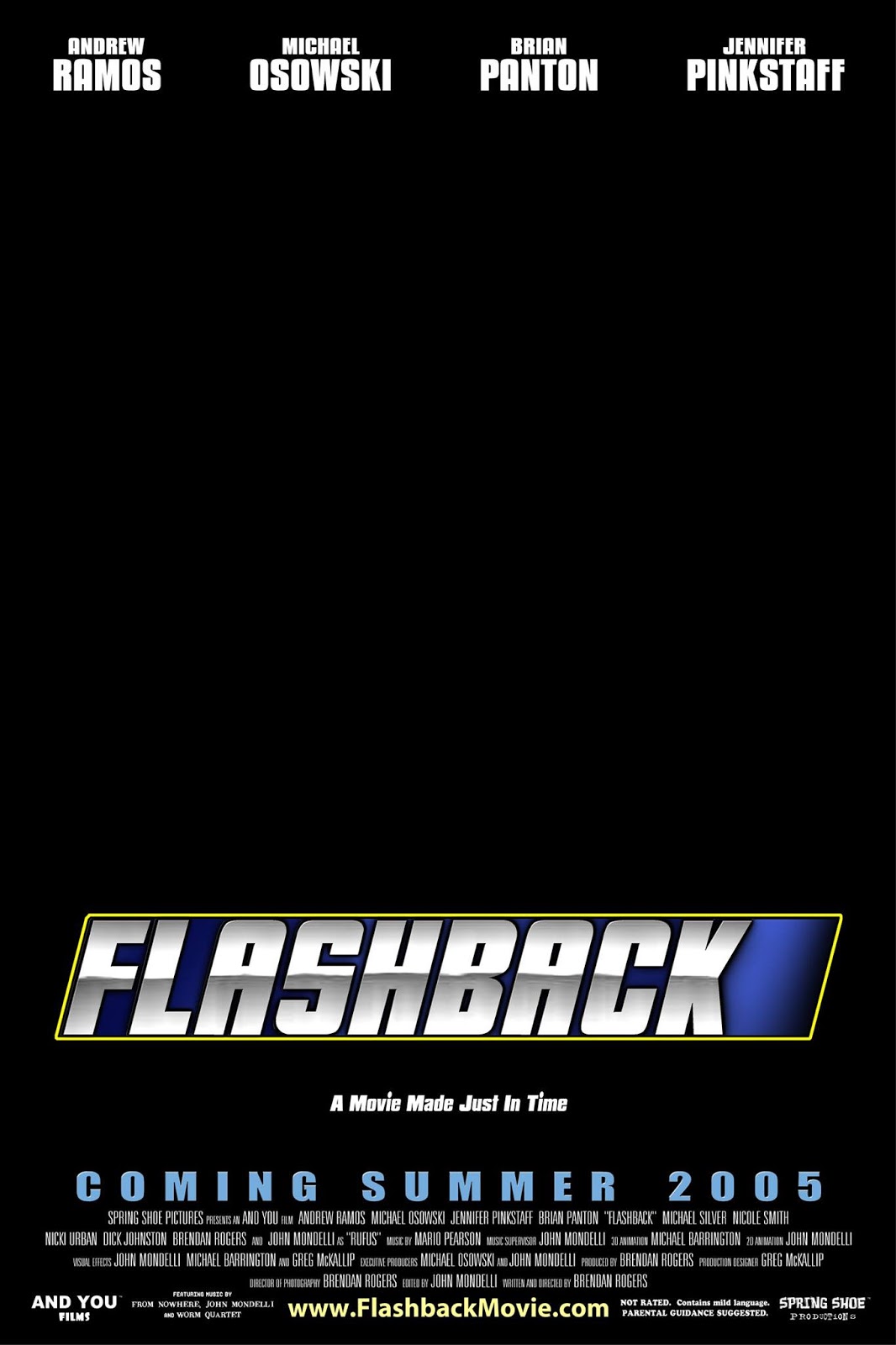
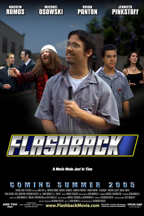
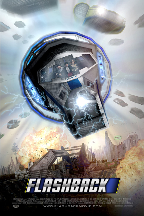
Flashback is a sci-fi adventure comedy made by three guys in a garage, and filmed entirely on blue screens with an all-digital world. Much like the film itself, the story of Flashback‘s poster art is over a decade in the making. These early pre-2005 designs aimed to be sleek, but were equally plain, and dependent solely on the title/logo.
 Note the early, clunky (but admittedly more colorful) title Lights…Camera…Time Travel — which matched the original short-film screenplay draft. Also worth nothing: the very optimistic “Summer 2005” release date since Flashback as we know it would start filming that very summer.
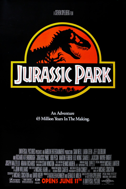
It’s clear from these initial designs that we wanted to be Jurassic Park. You can get away with nothing but a title logo on black if your Steven Spielberg, Michael Crichton, and a Tyrannosaurs Rex skeleton — but if you’re unknowns wanting to get known, it’s probably not a good idea to keep things vague and mysterious.
Flashback‘s similarity with Jurassic Park though is that both movies are named after a brand that exists within the framework of the story itself. Much like Jurassic Park logos adorn merchandise, vehicles, and clothing throughout the movie’s theme park setting; Flashback logos adorn buildings, fake movie posters, and more throughout the in-movie Flashback Films studio back lot. So the desire to create a similar brand identity was clear, if misguided.
The next evolution in poster design occurred during production, and prominently featured the cast (who were also the crew) on each and every mock-up.

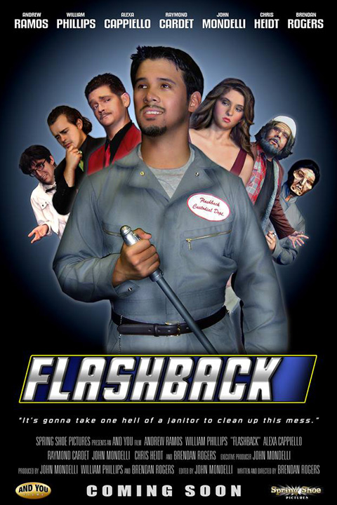
These designs aren’t too pretty, but when you’re an indie production and want your team to stick together over the course of four summer filming sessions, printing something like this out at 27×40” and letting it loom over the proceedings like a finish line can be very motivational.
The first of the above designs was the final made for a pre-2005 attempt at putting the movie together. After a year’s hiatus of pre-production, script-revising, and cast-rebuilding, Flashback began filming in May 2005 with a similar poster (above, center) and an updated but still laughably optimistic release date of “Summer 2006.” The third design was by far the cleanest cast montage yet, and wisely changed the release date to “Coming Soon,” but our lead actor, Andrew Ramos, was wise to point out that it made us all look like a deck of fanned-out cards.
As things progressed, Flashback producer and poster-designer (and much else) John Mondelli grew greatly as a Photoshop artist. And as post-production got underway, the world of the Flashback studio back lot finally began to come together. We began to take the poster design a lot more seriously, and our dream poster had always been something like this:
We knew we had invented a crazy world full of kooky characters, vehicles, hijinx, explosions, et cetera — and our hero was the lone human janitor that had to clean up the best. What better way to showcase our wild digital world and the enormity of our hero’s task than to have him standing at the Flashback Films studio gates, back to the viewer, looking out over the madness he must tame?
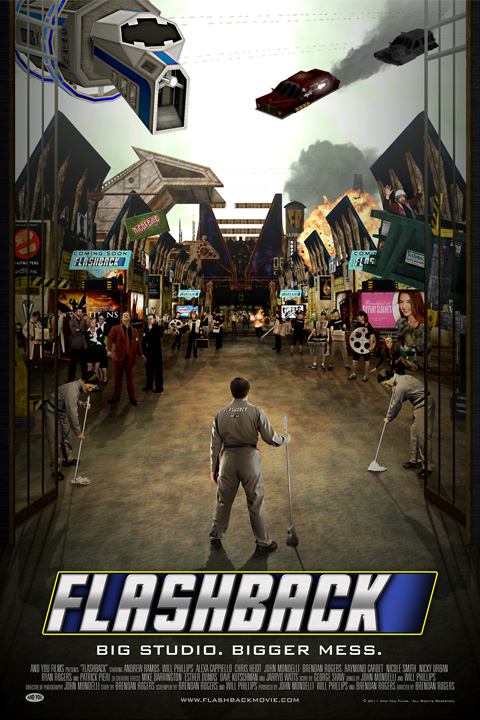
We put a LOT of effort into this design. A closer look will reveal incredible detail with characters and antics piled upon other characters and other antics. We’ve got the time machine, a car chase, janitor robots, the studio gates, our panicked villain along with the angry board of executives who hound him, our hero’s hobo sidekick trapped in a dumpster, our studio’s starlet Tiffany Sloane featured on a billboard, our evil soda company Nicofeine featured on another billboard, the studio water tower, parody movie posters, tons of PAs, a man on fire, a velociraptor — it’s exhausting. Probably too exhausting. And what’s smack dab in the center of the poster? Our hero is just below center, so just above him is, yes, you guessed it: nothing.
There’s much we still love about this teaser poster, especially when blown up nice and big — but it loses a lot when shrunk down, and is hard to decipher at any size if you aren’t already familiar with Flashback and its world.
But it’s probably a good idea we didn’t go in this direction. Flashback‘s years in post-production were 2008-2011 — years in which movie posters looked something like this:


Can I get an LOL?
While this was going on, we were swayed by another kind of design, sported by a very retro poster:


On the left we have the poster for Captain America, on the right we have John Mondelli’s parody of that poster featuring the Flashback characters. This was done as a joke (similar to Hobo with a Lightsaber) — but it quickly excited us. Perhaps it was vanity that made us thrilled to see our cast featured front and center once more, but no longer resembling a losing hand at Poker. We decided to see what we could do with this style, but made it more our own, giving added prominence to marketable features like our time machine, car chase, and dinosaur:

We loved this. Still do. It became the poster for Flashback‘s private premiere screening, and was slick enough to aid us in finding distribution. But while we’re proud of the design, and we think it’s particularly engaging for fans of the film who know the characters – it still lacks a central focus enticing enough to attract an “off-the-street” viewer. Our distribution company knew this and pushed us to develop the design further – focusing on and amping-up the action/sci-fi nature of the film. After all, if a film doesn’t have any known stars, it has to rely most heavily on its genre for public attention.

Our first instinct in pushing the design was to go back to our “hero vs. the world” teaser design, but amp up the sci-fi nature of the film by making the time machine prominent and center; while amping up the action-packed side of the film by rotating the image 15 degrees counter-clockwise. This design (left) never saw the light of day anywhere but after digging it out for the first time in years — we actually quite like it. But it’s also easy to see how “man looks up at some sort of thing” isn’t exactly a captivating pitch.
We were told to amp up the explosions, make it clear the time machine was a vehicle, and increase the amount of flying cars. For the near-final design (right) we kept the tilted angle, but moved the time machine to face front-center with our characters in clear view behind the controls. By putting it above the studio in a traffic lane, we were able to add in dozens of flying cars above a clearly futuristic skyline.
We liked it, but it needed something extra — and in large part that was to kill our darling title treatment. The ‘little logo that could’ finally had to be let go:

By removing the pristine brand-like logo and setting the title in a simplified, in-action position that matched the angle of the time machine — now the whole thing felt complete: futuristic, sci-fi, action-packed, and (dare we say?) fun!
And as an added bonus, by embellishing the explosions and lightening effects we also heightened the saturation of the artwork’s blues and oranges.
Which may or may not be a Hollywood poster thing:
So was that the end of our poster-crafting journey? Almost.
The above design became our calling-card — the U.S. DVD cover, the image on Amazon Prime, and iTunes, our website, and many more — but the team who marketed Flashback in the U.K. had other ideas when they got hold of our artwork files:


And you thought OUR final version was blue and orange! So the British marketing team removed the actual studio backlot and added some very normal looking skyscrapers; played a ton with the lightning and fire; added more starship-like flying cars (top, center) that definitely aren’t in the movie; and darkened the time machine’s viewscreen to obscure the image of our non-name cast.
Oh, yeah: and they changed the name of the whole movie! No, we don’t know who the Time Lord in Flashback is, but at least now British grandmothers will accidentally purchase our movie for their soon-to-be-disappointed Whovian grandchildren!
And that’s how a simple logo set on black evolved into a blue-orange Hollywood-style explosion-centric extravaganza. It was an education in balancing artistic impulses with marketability, and the UK end coda perhaps even took marketing too far. But learning to walk this tight-rope is a crucial part of trying to be an independent filmmaker who has films distributors believe they can sell.
As an epilogue, we’ll leave you with an image of the poster we currently use when touring Flashback around sci-fi/fantasy/comic/geek conventions — a marriage of the character spread with the final U.S. DVD cover design:

Thanks for reading; thanks for watching!